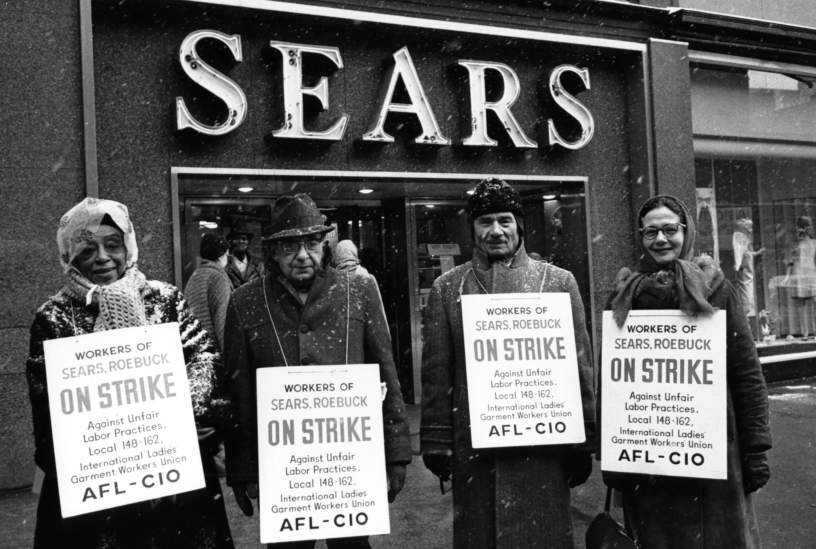
Sears Roebuck employees on strike against unfair labor practices, March 15, 1967.
THE ROUGHLY SEVEN AND A HALF MILLION PRIVATE-SECTOR UNION MEMBERS in this country are represented by just over 15,000 different local unions, most of which are affiliated with one of 132 national unions (around 750,000 belong to independent or unaffiliated locals).
Some locals are big—AFSCME’s Local 1000 (CSEA), with 230,353 members, AFT’s Local 2 (NYC teachers), with 190,975 members, or SEIU’s Local 2015 (CA caregivers), with 188,219 members—and others are small, like the ILA’s Local 1427 (Peoria), with two members. But while some unions have relatively even local memberships, others have huge disparities in size between their largest and smallest locals.
Size differences aren’t inherently a problem, of course, as long as every worker has an equal say in how the national union is run. But union local sizes display some interesting patterns, which can tell us something about the structure of the labor movement.
Finding data on every local union is tricky, since public sector locals are regulated by state, not federal, labor agencies. And complicated internal union structures involving intermediary bodies like joint councils can obfuscate which parts of the union directly represent actual workers. Here, we’ll limit ourselves to around 8,100 private-sector locals belonging to 44 national unions with the best federal data quality.
Then, chanelling Bernie Sanders, we’ll ask: for each union, how much of the overall membership do the top x% of locals represent? For instance, at the SEIU, the top 3 locals (around 4%) represent just under 40% of the total members.[1] By repeating this calculation for the top 1%, top 2%, and so on, we can trace out the curves below, which capture the distribution of sizes of union locals.
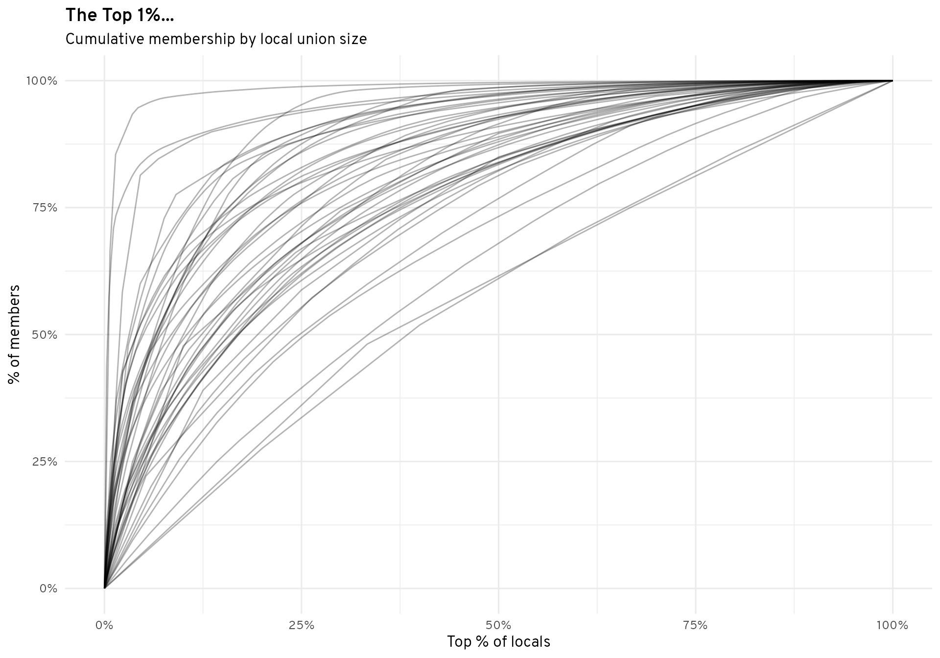
Curves which are squished into the top left corner represent unions with huge caps between the largest and smallest locals. Curves which are closer to the 45° diagonal represent unions with more equally-sized locals.
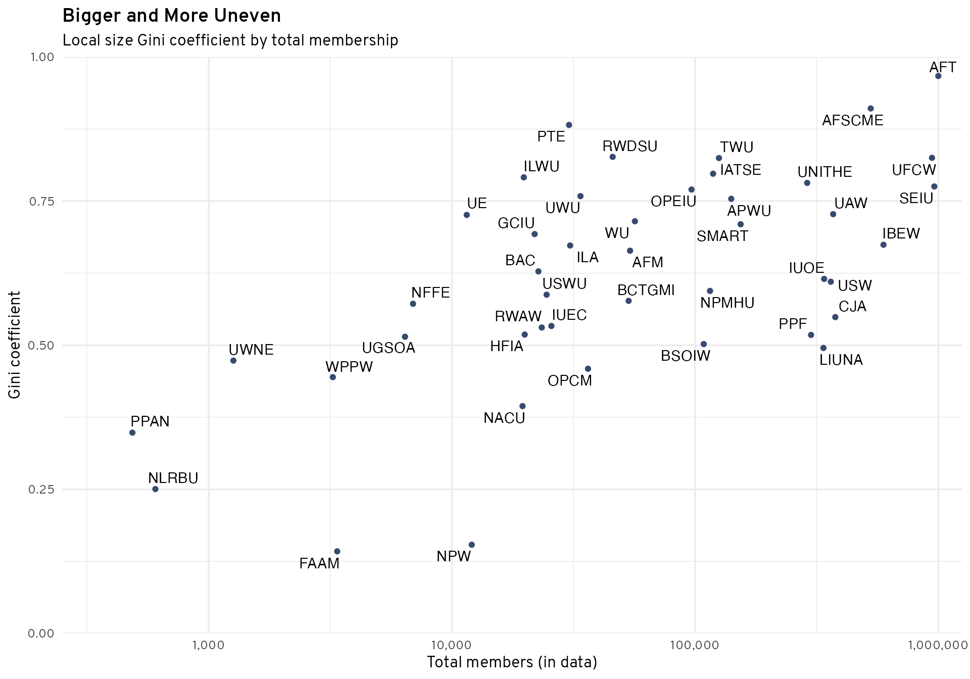
To capture these curves more quantitatively, we can borrow an income inequality measure: the Gini coefficient. It (roughly) measures the ratio of the area below each of these curves to the total area. Values closer to 0 mean equality of local sizes, while values closer to 1 mean inequality of local sizes.
| Union Gini Coefficients (Local Size) | ||
|---|---|---|
| No. | Union | Gini index |
| 1 | AFT | 0.97 |
| 2 | AFSCME | 0.91 |
| 3 | PTE | 0.88 |
| 4 | RWDSU | 0.83 |
| 5 | UFCW | 0.83 |
| 6 | TWU | 0.82 |
| 7 | IATSE | 0.80 |
| 8 | ILWU | 0.79 |
| 9 | UNITHE | 0.78 |
| 10 | SEIU | 0.78 |
| ... | ... | ... |
| 35 | BSOIW | 0.50 |
| 36 | LIUNA | 0.50 |
| 37 | UWNE | 0.47 |
| 38 | OPCM | 0.46 |
| 39 | WPPW | 0.44 |
| 40 | NACU | 0.39 |
| 41 | PPAN | 0.35 |
| 42 | NLRBU | 0.25 |
| 43 | NPW | 0.15 |
| 44 | FAAM | 0.14 |
What happens when we compare unions’ Gini coefficient to their overall membership? Larger unions overall have larger size disparities between their locals, on average. This means that their overall membrship is disproportionately driven by a few large locals. For example, the AFT’s total membership in large part consists of it’s Local 2 (UFT), representing New York City teachers. At the other end of the scale, the small NLRBU (NLRB employees’ union) is organized around regional locals with a few dozen members each.
Data provided by the Office of Labor-Management Standards, a division of the U.S. Department of Labor.
[1] Of the members and locals represented in our data.