Redistricting Simulation
In evaluating a redistricting plan, it is important to consider not just the partisan and other characteristics of the plan, but also what other plans might have been adopted in its stead. To do so, we generate a large number of random redistricting plans according to a set of criteria, using a recently-developed computer algorithm (McCartan and Imai 2020). This algorithm generates redistricting plans which:
- Have districts with equal populations (up to a chosen percentage deviation from full equality)
- Have geographically contiguous districts
- Have districts which are compact (i.e., no strange shapes)
- Are not generated using any political information.
Often, we will also ensure that district boundaries follow county lines as much as possible.
The algorithm works by starting off with a blank map and drawing new districts one at a time, across many maps in parallel. After each round of drawing districts, the set of partially-drawn redistricting plans is shuffled around, with some plans dropping out and other plans being copied, according to a mathematical formula. This shuffling and discarding and copying ensures that the simulated redistricting plans are truly representative and do not contain any unknown or hidden biases.
District Vote Share Plots
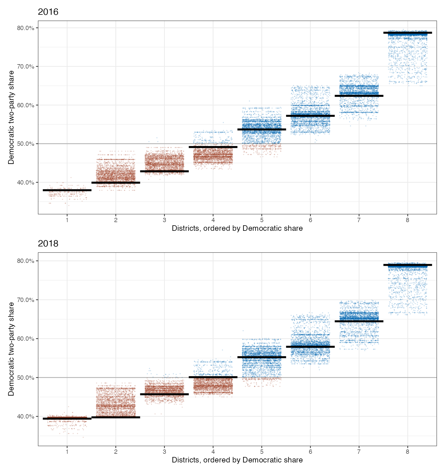
For most plans, we’ll spin up a graph like the ones below, from Colorado’s preliminary districts. Each dot represents a district in a possible plan, with blue dots representing Democratic-controlled districts and red dots Republican-controlled districts, and the districts are arranged by how Democratic they are. The black lines show the estimated election results under the newly-proposed plan. When these lines are lower than their corresponding set of points, that indicates that the proposed district has fewer Democratic voters than would be expected under an average fair and neutral map.
Our Scoring System
We give each redistricting plan a Redistricting Analysis Plan Score, based on two criteria: proportionality and representativeness.
Proportionality
This is measured as the difference between the statewide Democratic popular vote and the share of seats won by Democrats. If negative, then the plan favors Democrats; if positive, it favors Republicans. An ideal plan would score zero. But often what scores are possible is an inevitable consequence of the state’s political geography. So we score a plan relative to the set of simulated, hypothetical plans. If it is in the top 20% of simulated plans by proportionality, it earns an “A”. If it is the next 20%, a “B”. And so on, with a plan in the bottom 20% scoring an “F”.
Representativeness
This is measured as the odds than an average voter will be represented by a legislator of their preferred party; the higher this value is, the better. As with proportionality, how well a plan scores according to this metric depends on the state’s political geography, so we score a plan relative to the simulated plans. Just like with proportionality, if it is in the top 20% of hypothetical plans by proportionality, it earns an “A”, and so on.
Data
Most data used in these analyses is sourced from the ALARM Project’s precinct-level data files, which use data from the 2020 Census and the Voting and Election Science Team. Cleaned data in formatted to work with our analysis software packages is available here.
To produce election data using 2020 precinct boundaries, election results were projected down to the 2010 block level using voting-age population as weights. Results for 2020 blocks were then estimated using 2010 blocks and the land-use-based crosswalk files from VEST. Finally, 2020 blocks were aggregated to 2020 precincts using the Census’ 2020 block assignment files.