On September 3, 2021, the Senate and House Interim Committees on Redistricting released two opposing plans as potential starting points for drawing Congressional Districts. Oregon gained one seat following the 2020 Census, raising its total seats to 6 for this decade. In Oregon, plans are proposed by the state legislature and signed by the governor as regular legislation. Currently, both the state legislature and governor’s office are controlled by Democrats.
“Plan A” was released by the committees’ Democrats, and “Plan B” by the Republicans. Since Democrats control the legislative process, Plan A, or something like it, is significantly more likely to be enacted. Traditionally, however, redistricting in Oregon has been relatively bipartisan. The final enacted plan may differ significantly from both Plan A and Plan B.
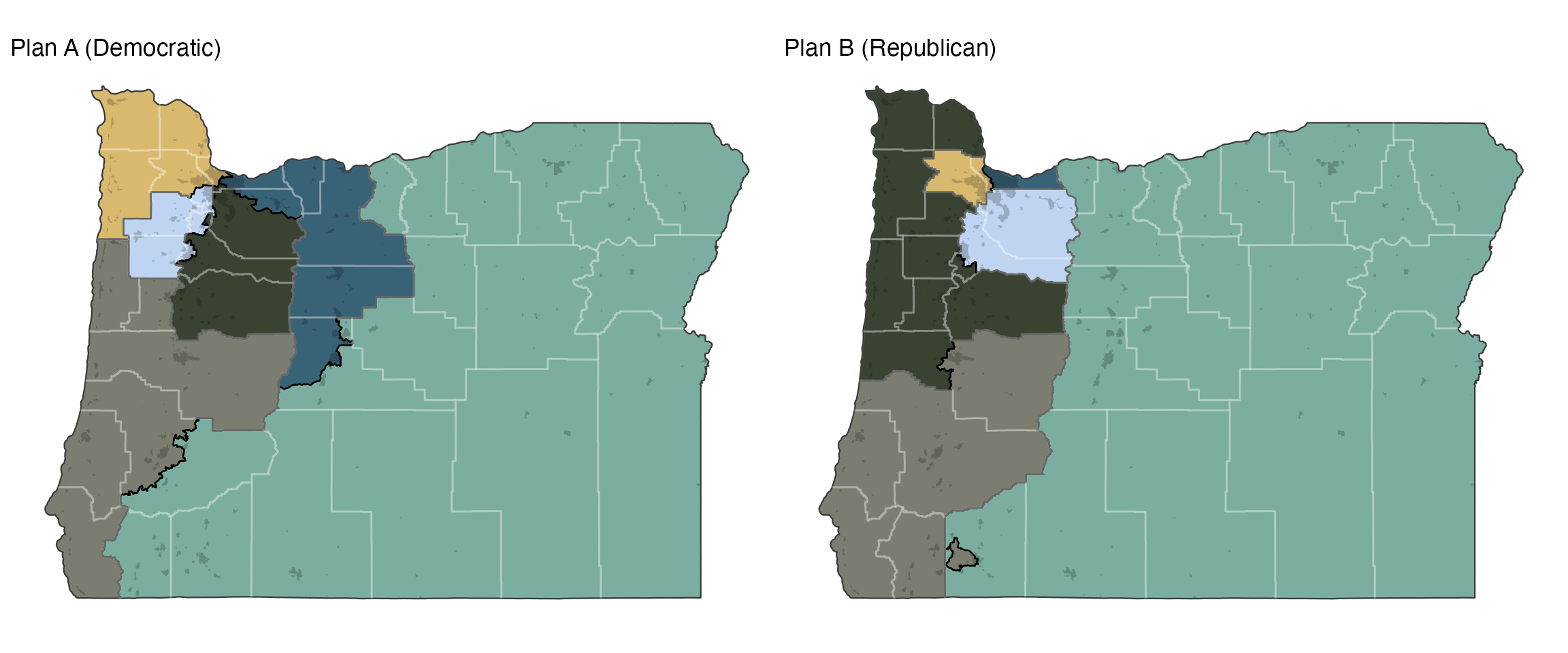
Figure 1: The preliminary congressional districting plans.
Oregon is dominated, demographically and politically, by the Portland metropolitan area. The state went 55% Democratic in 2016. This presents a challenge for Democratic map-drawers, who need to figure out a way to spread Democratic votes from Portland to the rest of the state, while preserving communities of interest and avoiding non-compact districts.
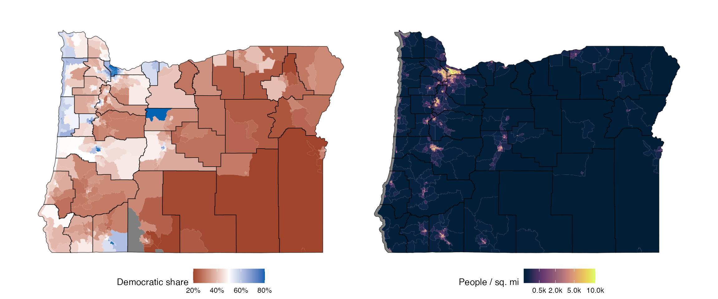
Figure 2: Population density and political patterns (2016 election) in Oregon.
Political Features of the Proposed Maps
As with all of our analyses, we compare these proposed plans with a large set of simulated plans, allowing us to understand how they differ from what might be reasonably expected.
](oregon-preliminary-congressional-districts_files/figure-html5/dem-distrs-1.png)
Figure 3: Democratic vote by district for the proposed plan and for 10,000 alternative plans. Learn more about this plot
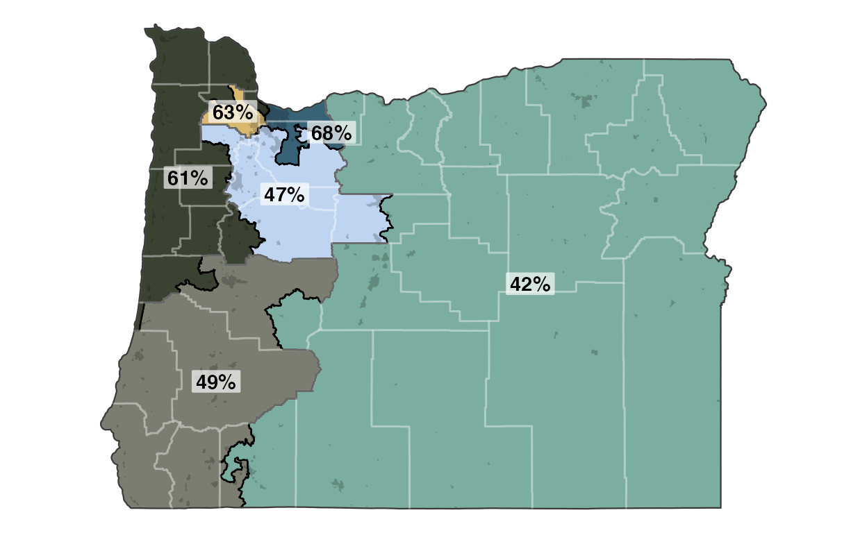
Plan A has a relatively safe 5D–1R split, which is more than the 4D–2R split that is most common from our set of simulations (with one seat from each party being competitive). The least-Democratic seat (numbered 2 on the figure below) is a particularly egregious departure from the set of simulated alternatives—no sampled plan came anywhere close to it. Plan B has a much safer Republican seat and 3 competitive seats that in a Republican-favoring year like 2016 could go Republican, leading to a 2D–4R split. Unsurprisingly, each plan favors the party that drew it.
Proportionality and Representativeness
All our plans are given two R.A. Plan Scores, one for proportionality—how close the seats distribution reflects the statewide vote—and one for representativeness—the odds that an average voter is represented by their preferred political party. The scores for Oregon are shown above. The graph below shows the proportionality and representativeness for all of our simulated redistricting plans, and the two proposed plans.
](oregon-preliminary-congressional-districts_files/figure-html5/prop-repr-1.png)
Figure 4: Proportionality and representativeness for the redistricting plans. Learn more about these measures
The GOP Plan B is slightly less representative than the Democratic Plan A, but is vastly more proportional.
What would a good plan look like according to these two measures? The map below is the simulated redistricting plan which scored the combined best on proportionality and representativeness. It has two safe Republican seats, three safe Democratic seats, and one competitive seat.
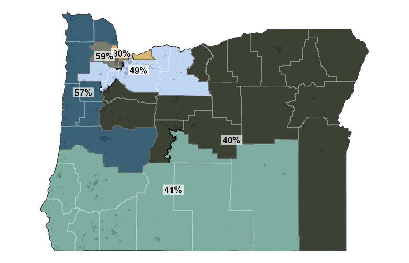
Figure 5: The sampled plan with the best combination of proportionality and representativeness, with Democratic vote shares labelled.
Locating Goldilocks
How might we locate a compromise plan between these two? The two proposed plans are clearly very different. Quantifying the differences can be difficult for redistricting plans. We opt to use a variation of information metric. It is scaled so that a score of 0 indicates that the maps are completely different while a score of 1 indicates that the maps are identical. With those scores, we utilize a simple, but effective optimization method known as short bursts to traverse the information space between plans.
Below, we present 7 intermediate plans, which are approximately evenly spaced in information space between Plan A and Plan B.
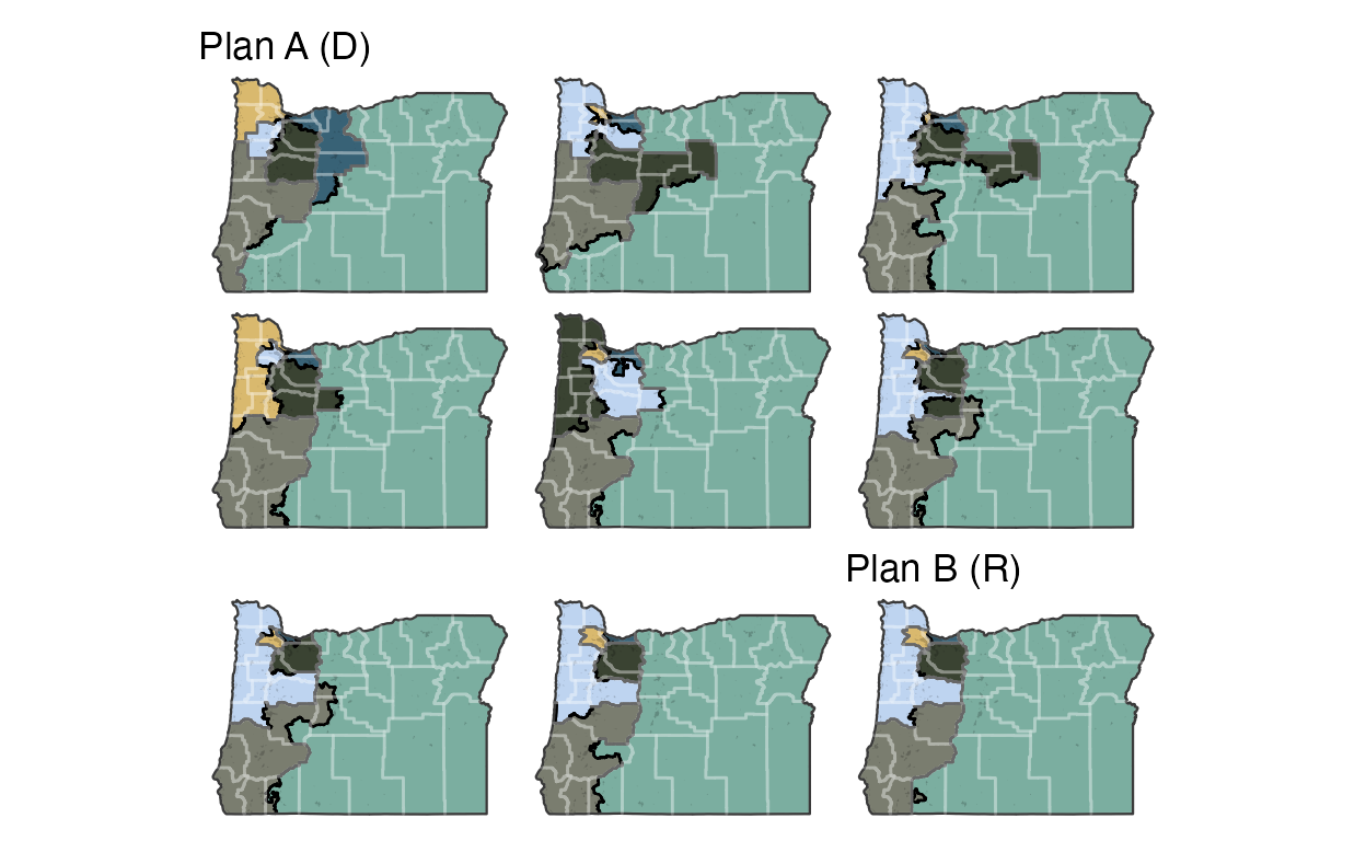
The middle of these example plans has 3 expected safe Democratic seats, one safe expected Republican seat, and two expected competitive Republican-leaning seats.