This post follows up on a previous analysis of Colorado’s congressional redistricting plan. Since then, staff for the Colorado Independent Congressional Redistricting Commission have released an updated congressional map. This new map has already been criticized for its partisan balance and boundary lines.
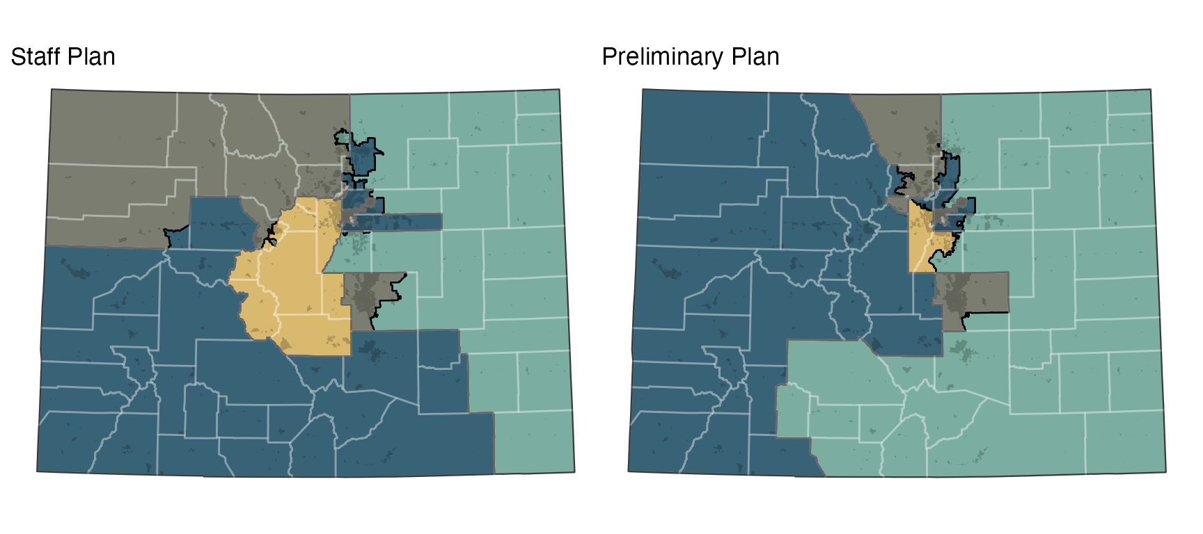
Figure 1: The preliminary congressional districting plans.
Political Features of Both Maps
As with all of our analyses, we compare these proposed plans with a large set of simulated plans, allowing us to understand how they differ from what might be reasonably expected.
](colorado-staff-congressional_files/figure-html5/dem-distrs-1.png)
Figure 2: Democratic vote by district for the staff and preliminary plans and for 10,000 alternative plans. Learn more about this plot
Compared to the preliminary plan, the staff plan makes 1 Republican district and 1 Democratic district more competitive. The nearly-evenly-split district (numbered 4 above) remains highly competitive.
Proportionality and Representativeness
All our plans are given two R.A. Plan Scores, one for proportionality—how close the seats distribution reflects the statewide vote—and one for representativeness—the odds that an average voter is represented by their preferred political party. The scores for Colorado are shown above. The graph below shows the proportionality and representativeness for all of our simulated redistricting plans, and the two proposed plans.
](colorado-staff-congressional_files/figure-html5/prop-repr-1.png)
Figure 3: Proportionality and representativeness for the redistricting plans. Learn more about these measures
Neither plan is very proportional, giving Republicans slightly more seats, on average, than would be otherwise expected. But the preliminary plan was more representative, with fewer competitive districts. This meant that more voters were expected to be represented by someone of their party.
What would a good plan look like according to these two measures? The map below is the simulated redistricting plan which scored the combined best on proportionality and representativeness. It has three safe Republican seats, four safe Democratic seats, and one competitive seat—not unlike the preliminary plan. But overall it is both more proportional and more representative.
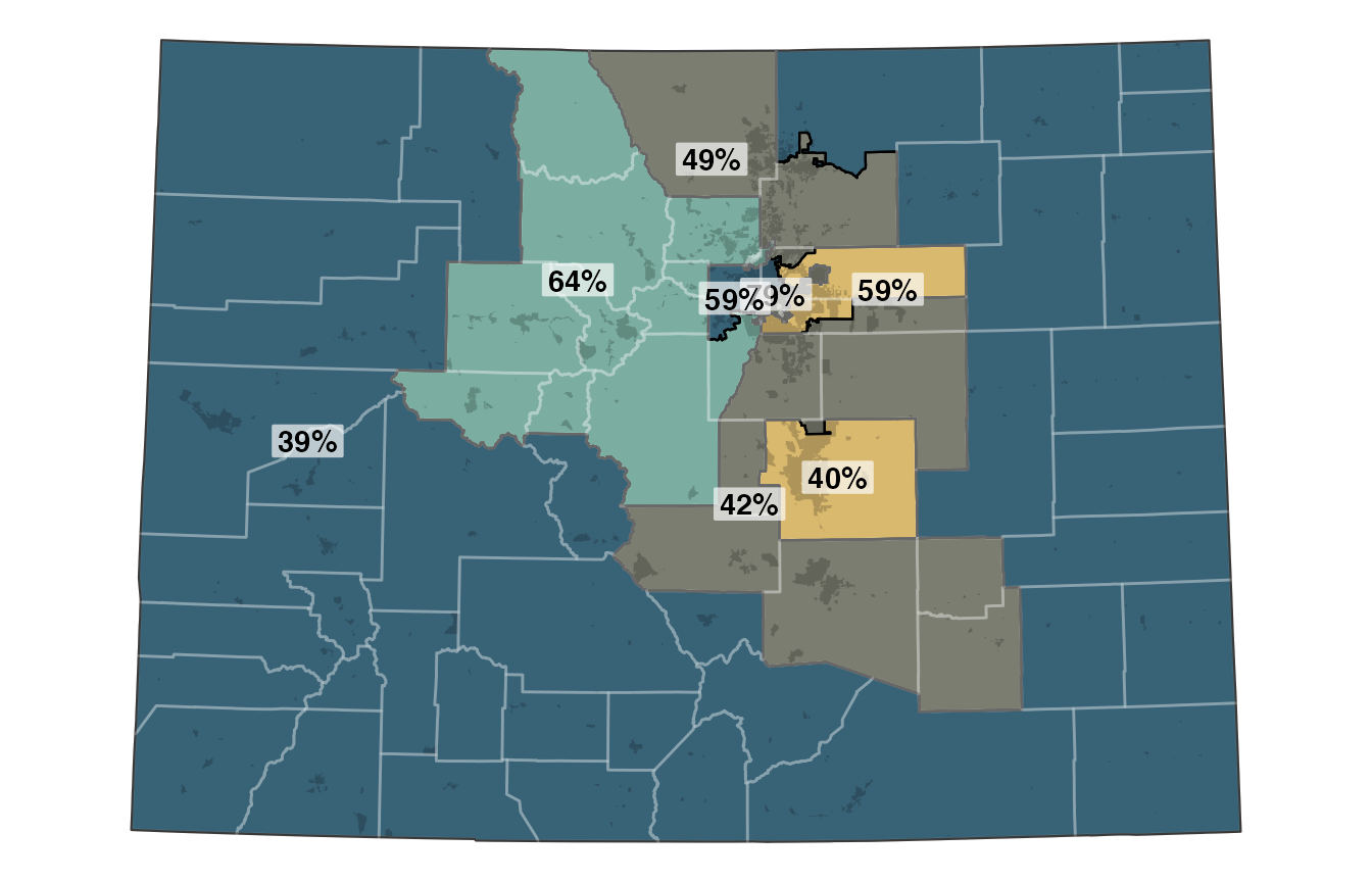
Figure 4: The sampled plan with the best combination of proportionality and representativeness, with Democratic vote shares labelled.